
 Main Logo
 The project
865 Fencing is a fencing company based in Knoxville, TN. Owner Caleb Kessler came to us looking for a logo refresh that would better represent the quality of his work. He wanted something clean, simple, and versatile enough to hold up across all platforms without leaning on color to carry it.
Caleb shared that his favorite style of fence is a classic picket, and that he wanted to hold onto his original UT colors. With that as our foundation, the rebranding process began.
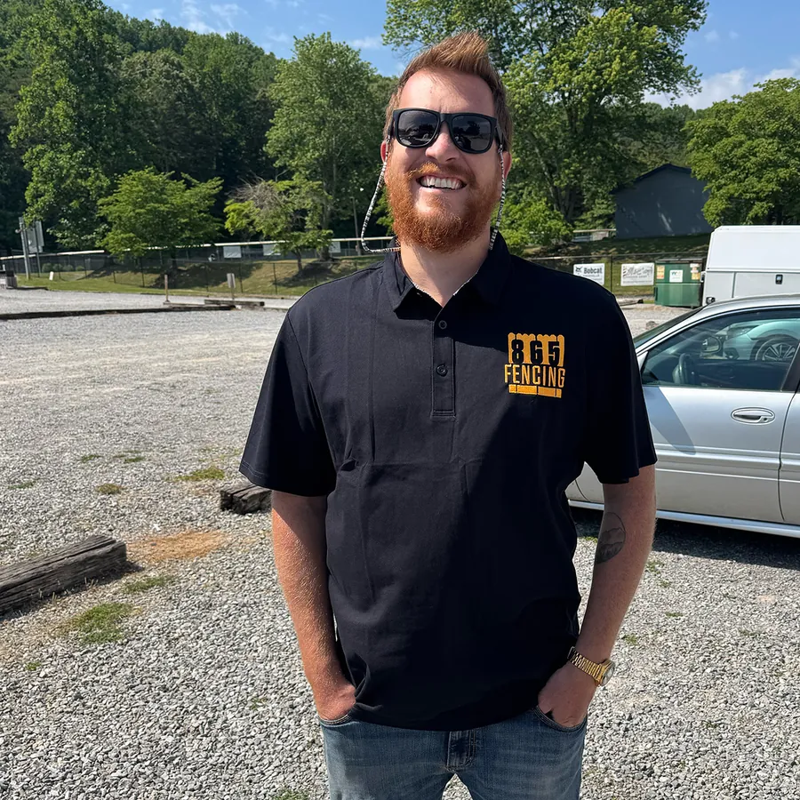
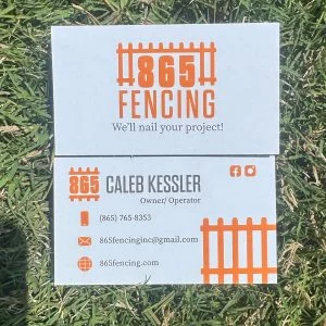
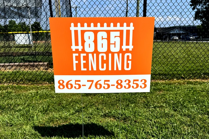
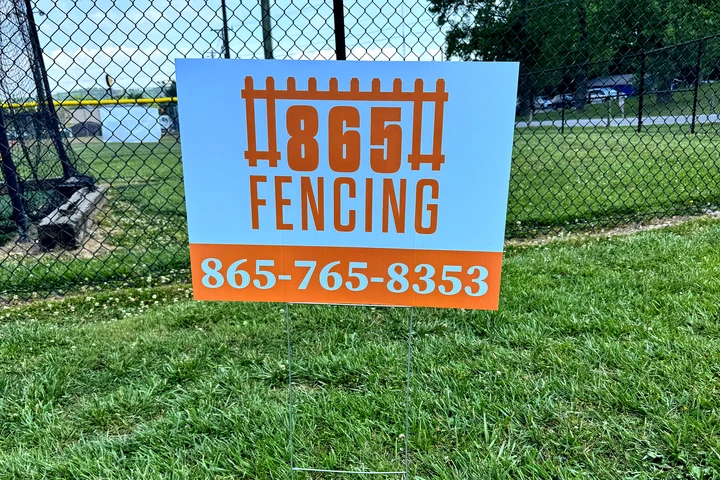
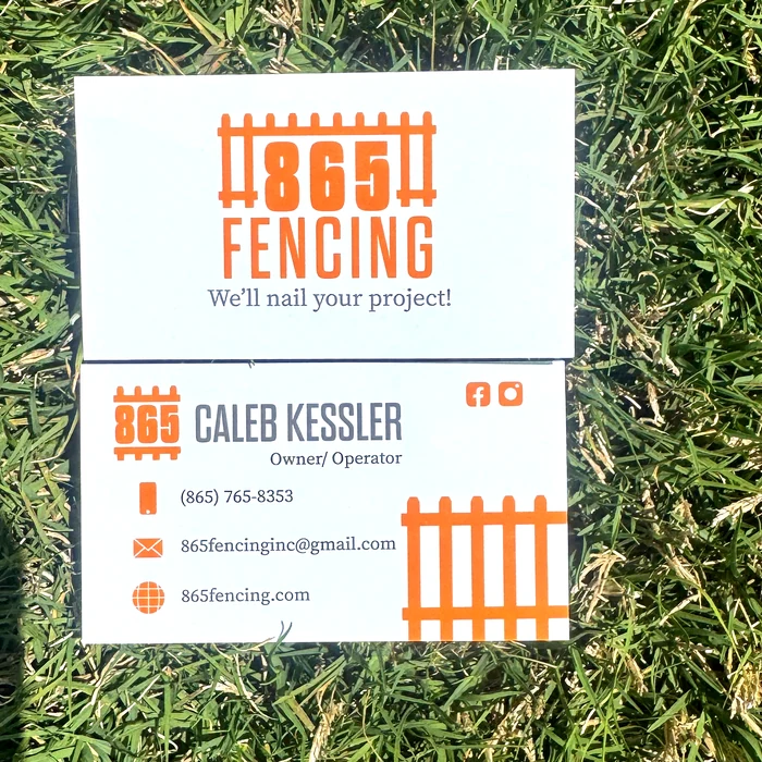
Once the logo suite was complete, we moved right into branded collateral including business cards, yard signs, and polo shirts. The business cards gave us a chance to use the vertical logo on one side and the standalone icon on the info side, making great use of both orientations. The yard signs showed just how much a color variation can bring a design to life while keeping the brand identity completely intact. The polos were the perfect opportunity to see the alternate logo out in the real world.
865 Fencing is a great example of why a rebrand can be so impactful. A logo is essentially a company's curb appeal. It's the first thing a potential customer sees before they ever experience the service itself. An outdated or cluttered mark can quietly cost your business without you even realizing it, while a strong one works for you around the clock.
Brand in use

Want a brand like this?
Tell us about your company and what you have in mind. Nicholas will get back to you personally.