 Main Logo
 The project
Lazy M Farms is a versatile farm based in Corryton, Tennessee. From raising beef cattle to creating custom cutting boards, they do a little bit of everything. So before we could build the brand, we needed to answer one important question: What is at the heart of Lazy M Farms?
After talking with the owner, the answer became obvious. The cattle. His passion came through immediately as he talked about his herd of Limousin cattle and the quality of beef they produce. We knew that needed to become the centerpiece of the brand.
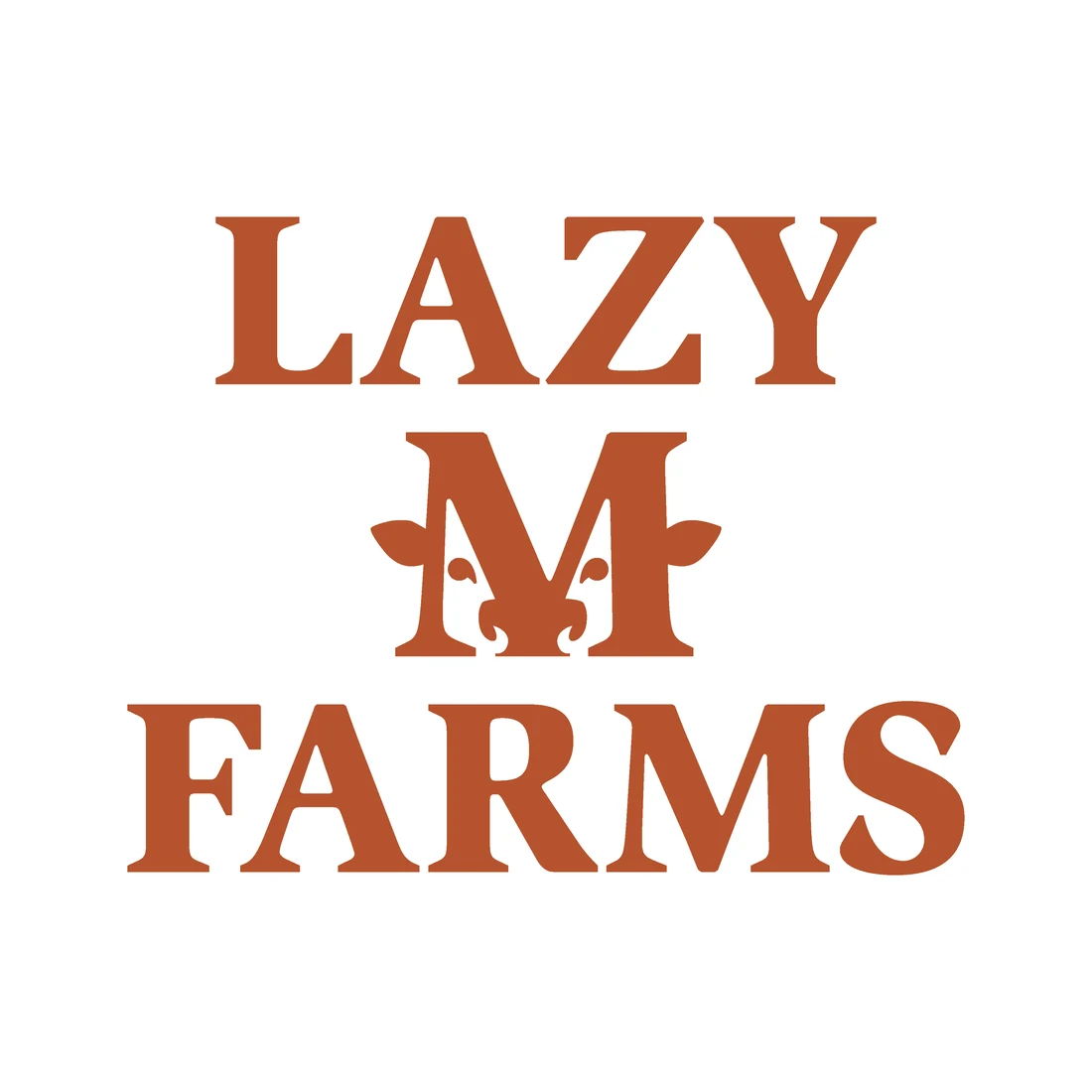
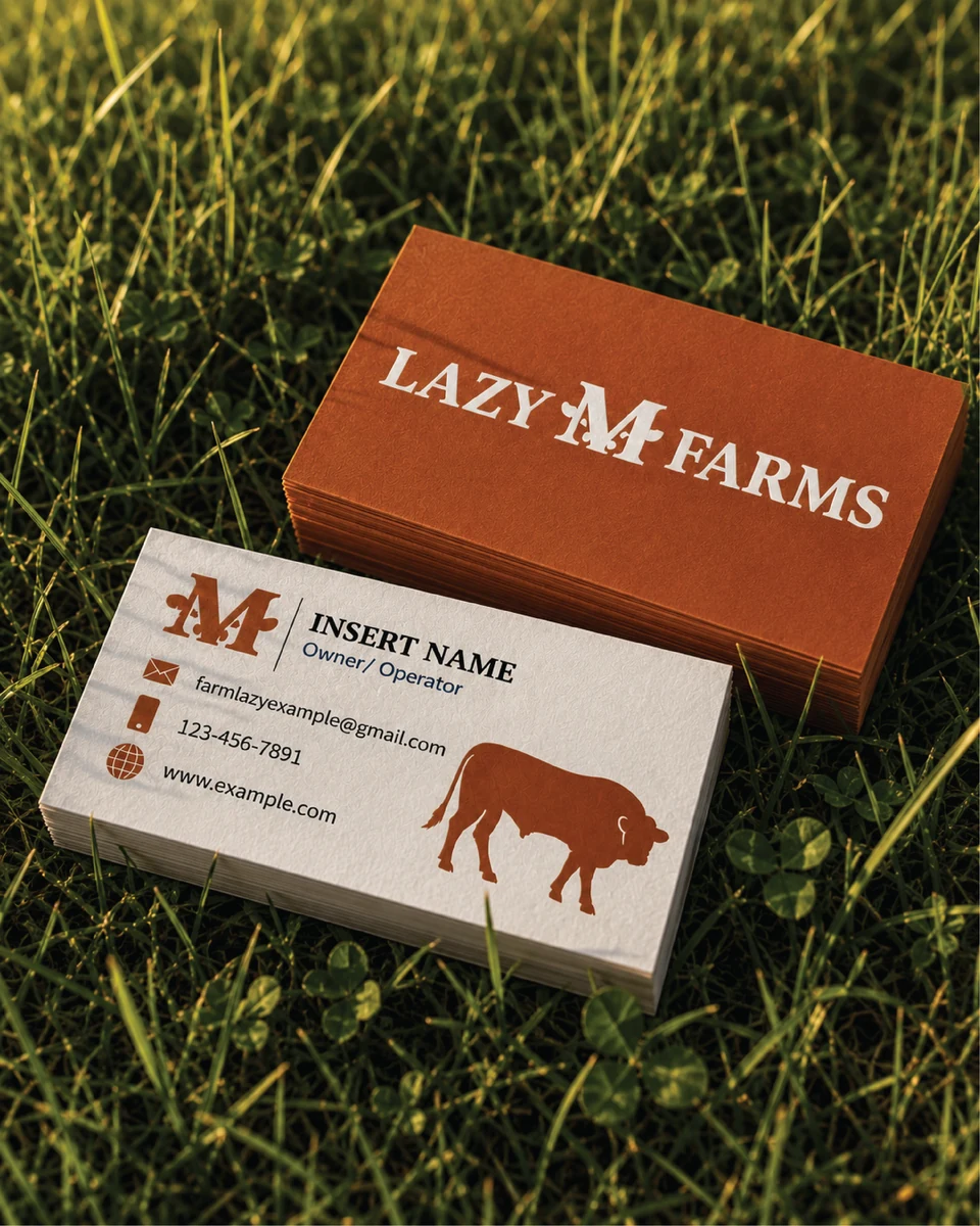
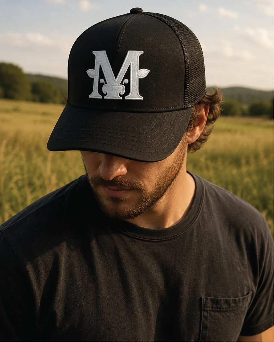
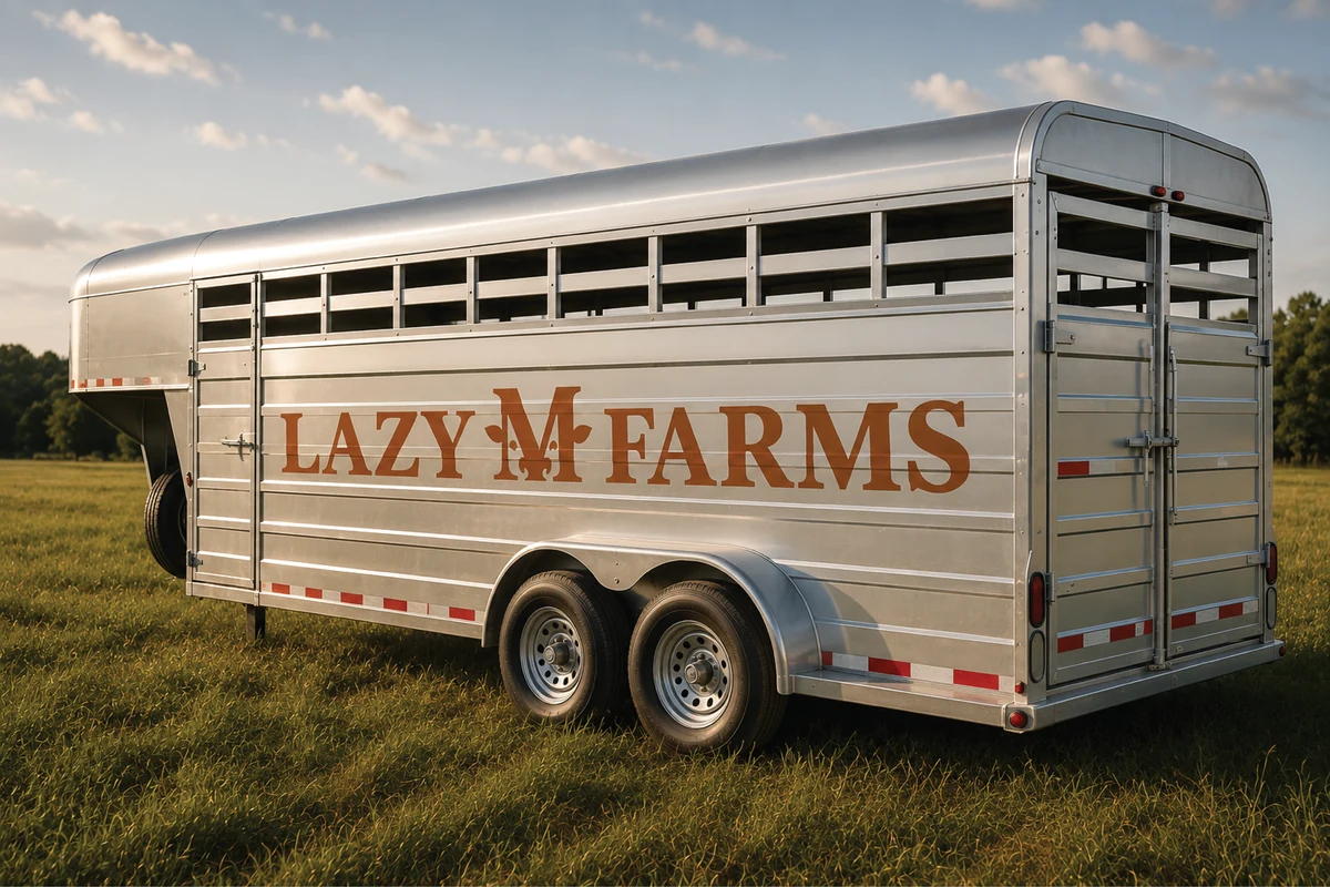
From there, the challenge was finding a creative way to incorporate the cattle without simply placing a cow next to the name. The “M” was already the natural focal point of Lazy M Farms, so we transformed it into the face of a cow. That custom M became the foundation of the identity, working both within the full logo and independently as a recognizable icon.
We paired it with a classic, old fashioned Western ranch typeface that feels right at home on a cattle farm while still remaining clean and timeless.
The result is a brand that feels unmistakably Lazy M Farms. Rooted in what they do, built around what they care about, and designed to be recognizable anywhere it shows up.
Brand in use
Want a brand like this?
Tell us about your company and what you have in mind. Nicholas will get back to you personally.